Wednesday, December 22, 2010

New iPod Nano, Zune HD

Back in 2004, when I got my first MP3 player, I never cared that it lacked a camera, Web browser and crystal-clear video playback features that are now common on digital media devices.

Apple's latest iPod Nano and Microsoft's freshest Zune, both released within the past week, offer these kinds of perks and plenty more. Neither is right for everyone, but both serve as a reminder of how far digital media players have come in just a few years.

Apple has sold more than 100 million iPod Nanos since launching the first one in 2005, and the latest version should cement its title as king of the prom.

At first glance, the new Nano seems very much like the previous version. It has retained its skinny legginess and curved sides, along with its crisp screen and slightly annoying shake-to-shuffle music feature. Astute gadget hounds may notice it has a slightly enlarged screen it's now 2.2 inches on the diagonal, up from 2 inches.

There are some major additions, though, that make this tiny tune toter really worth its price tag ($149/Rs 9,400 for 8 gigabytes of storage space; $179/Rs 11,200) for 16 gigabytes).

The first is located near the bottom of the Nano's back: A little video camera lens with a pinhole-sized microphone. The location is prone to fingers-over-lens issues, but because the Nano has a built-in accelerometer you can solve this problem by turning the device upside down and it will still know to film right side up.

Apple says it simply wasn't possible to place the camera anywhere else without making the Nano pudgier, so I'm willing to forgive this inconvenience.

The quality of Nano videos probably won't get you into Cannes, but the camera is so easy to use that I found myself looking for cool things to record while wandering around listening to music. I also loved its special effects filters, which let you film in old-fashioned film mode or "kaleidoscope" mode.

To my chagrin, there is no option to take still photos, and no zoom two features you'll find on many run-of-the-mill cell phones. Maybe next time, Apple?

The built-in microphone did impress me. It had some difficulties capturing sound from multiple sources at the same time, but noises generally sounded clear in videos. The microphone will also record voice notes something I've been awaiting for several years.

Another neat feature: Now the Nano has a built-in speaker. You won't notice it at first, since there's no speaker grill. But if you happen to play back a just-recorded video or a song without plugging in headphones, you'll notice that, indeed, the Nano is emitting sound. The speaker does not get that loud, and it doesn't sound incredible, but it's nice to have the option to listen out loud.

Sadly, the speaker doesn't work with the Nano's FM radio another new feature since the radio counts on your headphones to act as an antenna. The inclusion of a digital radio is long overdue, and it comes with a neat "live pause" feature that will store up to 15 minutes of the broadcast. This came in handy when I was listening to NPR and wanted to stop and make a phone call. I could just come back and catch up on the news a few minutes later.

Simply put, the new Nano gets nearly everything right. It even includes a built-in pedometer for logging exercise goals. There are plenty of tweaks Apple could and probably will make in the future, but it's still the best and smallest multimedia player you can buy for under $200.

Microsoft's Zune player has gotten steadily better since it was first released in 2006. Its latest effort, the Zune HD, gets several things right, including video and music playback. Still, there's still plenty of room for improvement.

The Zune HD ($220/Rs 10,560 approx. for a 16-gigabyte version; $290/Rs 13,920 approx. for 32 gigabytes) is packed in a slim, silver-and-black case that sports a fairly generous 3.3-inch touch screen.

The screen is one of the new Zune's best parts: It's very responsive to finger swipes and taps, and, as with Apple's iPod Touch, you can pinch photos to zoom in and out.

Videos and photos look super crisp, and I had no problem snuggling up with the Zune HD while watching an episode of sketch comedy show "The State" that I downloaded from the Zune Marketplace over the corresponding computer software.

The latest Zune includes a high-definition video function, so you can buy high-def movies in 720p resolution from the Zune Marketplace, and, if you shell out $90 for a dock, watch them on a high-definition TV. You can also watch them on the Zune, but the resolution will be lower.

More impressive was the addition of an HD radio receiver for accessing radio stations' digital HD radio content, which is transmitted alongside their regular analog broadcasts. HD stations sounded clearer than standard FM stations on the dial, but since the Zune already has a good FM radio I wasn't blown away.

I was pleased to see Microsoft finally built a Web browser into the Zune, which you can use when you're in a Wi-Fi hot spot. The Zune always had wireless capabilities, and the company seems to revel in rolling out related functions as slowly as possible. On the last Zune, users gained the ability to download Zune Marketplace songs straight to the device when connected to a Wi-Fi network.

The browser, which is based on Microsoft's Internet Explorer, isn't nearly as good as one you'd use on your computer. Given the screen size it was sometimes easier to view mobile versions of Web sites (sometimes you're automatically directed to them anyway), and there's no support for Flash videos like the ones on YouTube.

Still, it has an easy-to-use touch-screen keyboard for entering Web site addresses, and it's good for reading the news, checking e-mail or updating your status on Facebook.

One neat feature is the ability to assign "pins" to content you like basically, quick links that are kept in a side menu off the home screen. This made it easier to quickly access the Obi Best and Lady Gaga songs I can't stop listening to, along with my favorite Web sites.

Of course, Microsoft has heard the siren song of Apple's online App Store, and has added an "Apps" section to the Zune Marketplace, which you can access through your computer or the device itself. There are only a handful of applications available now I downloaded two games that didn't really impress but they are all free, and Microsoft plans to roll out Facebook and Twitter applications soon.

The Zune HD proves the device is starting to come into its own as a multimedia contender. It's not quite there yet, but I am curious to see what Microsoft comes up with next.
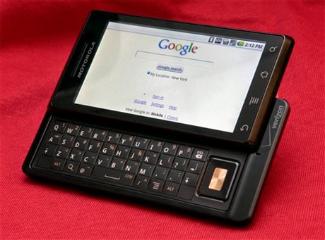
Review: Motorola Droid

Since its debut in 2007, millions of people have gravitated toward Apple's iPhone, wooed by its sleek hardware, simple user interface and abundance of applications.

Other smart phone makers have been trying since then to dispel the notion that the iPhone is the be-all and end-all of mobile gadgets. The latest push comes from Verizon Wireless and Motorola, whose Droid is a good alternative for those seeking a feature-packed smart phone with a full keyboard and strong wireless service.

The Droid stands out from the crowd of iPhone wannabes with a slim but weighty body, noticeably angular look and large touch screen.

Its 3.7-inch screen is bigger than the iPhone's 3.5-inch one, and the extra real estate really makes it easier to navigate Web pages and play with applications. It also offers plenty of space on the home screen (and two side screens that you swipe to see) for software "widgets" that give a quick look at such things as your friends' Facebook status updates or the song you're playing on the built-in music player.

And the Droid's cost is comparable with the iPhone's - $200, after a rebate, with a two-year service contract with Verizon Wireless, its exclusive US distributor.

The Droid runs the latest version of Google Inc.'s operating system, Android 2.0, which includes some enhancements such as the ability to zoom in on Web pages and photos by double-tapping on the screen. With one tap on a photo in your contacts list, you can also quickly see the ways in which you can contact your friends.

When it comes out on Friday the Droid will also be the first phone to include a cool, free mapping application from Google that can announce turn-by-turn directions.

Google Maps Navigation is easy to use and helped me out on a late-night ice cream run I put the Droid in my pocket, turned up the volume and followed its female-robot-voice instructions while riding my motorcycle across town.

I was glad to see that the application quickly recalculates your route if you're prone to making wrong turns as I am. And if you live in a busy city with unpredictable traffic, you might like an option for getting alternate routes, all of which you can see overlaid on the same map along with their distances and estimated driving times.

Like other Android phones, the Droid has a voice search function. It can be used, for instance, to help navigate routes when you're in the Maps Navigation application. Saying "Navigate to Starbucks in San Francisco" should give you a list of Starbucks Coffee shops. Pick one, and you'll get turn-by-turn directions.

I'll probably stick with using the Droid's keyboard to get directions, though, as it had a hard time understanding me. The phone tried to send me to Ikea when I asked it to take me from my office to my apartment. It offered me all sorts of unrelated results when I tried to get directions to a French restaurant near my home.

That's not to say the keyboard is perfect. Unlike many other phones with standard, "QWERTY" keyboards, the Droid has keys that are pretty much flat, which often made it hard to type accurately. This wasn't helped by the fact that, aside from the space bar, the keys are all the same size. Two blank key-sized spaces on the bottom of the keyboard one on the left, one on the right made me wonder why Motorola didn't try to at least enlarge the often-used "return" key.

One Droid feature touted heavily in Verizon's television commercials is its ability to run several applications simultaneously, which is something the iPhone can't do. Generally, I found that the Droid does this pretty well.

There were hiccups, though. As I was listening to music, I tried to take a photo to send in a text message to a friend. Elvis Costello started to stutter as I pressed the shutter button. Another time, I tried to make a call while the Maps Navigation application was running and had to endure very loud instructions about where to turn while the phone was ringing.

I did like the Droid's five-megapixel camera, which matches the resolution of another new Motorola phone that runs Android, the Cliq, and can take sharper shots than contemporaries like the iPhone, whose camera hovers around 3 megapixels. There's also a very bright flash another thing the iPhone and Cliq lack so you can take photos in low light.

The Droid's big screen makes for a nice viewfinder, and a small menu of camera settings slides out from the left side of the screen so you can adjust the white balance and use different color effects. You'll have plenty of space to store the photos you take, too, because the Droid includes a 16 gigabyte microSD memory card.

The Droid runs on Verizon Wireless' network, and I was pretty impressed with its speed as I surfed the Web, looked up directions or checked e-mail. It also got a generally solid reception for making calls, and while my friends' voices didn't sound as clear as they could, I didn't have problems with dropped calls.

Motorola has been struggling to come up with a phone that comes close to matching the popularity of 2005's Razr, and the Droid is the latest indication that Motorola is really trying to figure out what consumers want.

It's also one of the most promising challengers to the iPhone, a field that now includes Palm's Pre and Research In Motion's BlackBerry Storm2.

Some Verizon Wireless customers have been holding out on getting the iPhone available in the US only through AT&T because it means switching away from a service they are already used to and like. For them, the Droid might be a good reason to stick with that wireless provider.

Even if you aren't already using Verizon, if you're not swayed by the iPhone, you might fall for the Droid.

WikiReader

WikiReader


When I was a kid, my dad bought a copy of the Encyclopedia Britannica. It had 32 volumes and took up 4 feet in the book case. I loved to sit on the couch and flip through it, reading articles at random.

Now, I'm returning the favour, giving my father an encyclopedia that has the equivalent of 1,000 volumes. Yet it fits in his pocket, and it costs just $99.

There are few better illustrations of the staggering advance of digital technology than the new WikiReader. It's the size of a thick table coaster, and contains nearly the entire text of the English-language Wikipedia. That's 3.1 million articles, written and edited by volunteers around the globe.

The WikiReader is sold online and made by OpenMoko Inc., a Taiwanese company. The founder, Sean Moss-Pultz, says the inspiration for the gadget comes from the electronic translation dictionaries that are common in Asia.

Now, a lot of cell phones can access Wikipedia, so why would anyone want a WikiReader? Well, the fact that the WikiReader carries the text on a memory chip, rather than using an Internet connection, means you can use it anywhere: overseas, on a plane, in the subway. It's also faster and easier to use than most cell phones, and it has a bigger screen. The battery life is, to believe OpenMoko, outstanding. It says two AAA batteries will last in the WikiReader for a year, if you use it 15 minutes per day. I certainly wasn't able to exhaust it in a few weeks.

The face of the device is nearly filled by a monochrome LCD touch screen. To search the encyclopedia, you bring up an on-screen keyboard. To select links, you tap on them. To scroll, you move your finger across the glass.

There are four buttons: one for power, one for the search screen, one that lists the pages you just visited, and one that brings up a random article. I'm fond of that last one it brings back memories of my childhood reading habits.

Given the depth of Wikipedia, the Random button brings up the most obscure articles: An article about Caribbean vampire mythology is followed by the entry for a village in Poland, then a region of Antarctica, then the men's results from the 1967 Alpine Skiing World Cup, and so forth.

The simplicity of the device does come at a cost. It's hard to type search terms on the screen, and scrolling through long articles is tedious. There's no backlighting, so you can't read in weak light. Because the screen doesn't show color, the WikiReader doesn't even bother to show images.

Because the screen is narrow, the WikiReader doesn't show tabular material either. For instance, online, the "List of Battlestar Galactica episodes" is organised into a table, but it's missing from the device. OpenMoko says it plans to include tables once it figures out how to display them in a way that works on the screen.

The online Wikipedia changes every minute, but the WikiReader's content does not. It's a static snapshot. However, the manufacturer plans to provide free updates four times a year. To take advantage of that, you'd have to extract the chip from the WikiReader's battery compartment, stick it in a computer's card reader, and download the entire database.

OpenMoko also plans to provide a subscription service that mails new memory cards with updated content four times per year, for $29.

Limitations aside, the WikiReader is a cool idea and comes at the right time of the year. It makes an interesting gift for people without "smart" phones, or are heading out to see the world. Bookish kids will be entertained - there's no dinosaur you can't find in Wikipedia. And imagine what one of these could mean to a poor but literate teenager in a developing country.

Wikipedia doesn't encompass all of human knowledge, but it's certainly a delicious slice of it, and the fact that we can now pocket it is something to be amazed by and thankful for.

Windows 7

Next week, Microsoft is releasing Windows 7, a slick, much improved operating system that should go a long way toward erasing the bad impression left by its previous effort, Vista.

If you've been holding off on buying a new computer, Windows 7 will be a good excuse to get back into the game. And if you've been weighing a Mac versus a Windows PC, then you should know that "7" pushes the scales on the Windows side. Windows is now easier to use and better looking than it was before, while maintaining its core advantage of cheaper, more diverse hardware.

However, most PC users should not take the release of Windows 7 as a call to action, or feel that they have to run out and buy the software for use on a computer they're planning on keeping. The upgrade will most likely not be worth the time or money, much less the effort of hosting a Windows 7 "launch party" as Microsoft suggests.

Windows 7 will come in several versions. The one aimed at consumers is Home Premium, which will cost $120 if bought as an upgrade to XP or Vista. You can buy it as a download or on a disc. Beginning on October 22, it will come installed on new PCs.

Here are some of its highlights:

The taskbar the strip of icons usually found at the bottom of the screen now does more than show which programs are running. You can also stick icons for your favorite programs on it, to launch them quickly. It's fast and convenient, combining the best features of the old Windows taskbar and Apple's Dock.

File folders can now be organized into "libraries." You can have a photo library, for instance, that gives you quick access to pictures in folders spread out over your hard drive, or even several hard drives. This is great because many applications don't automatically put files into Microsoft's My Documents and My Photos folders, and tend to deposit content in their own folders. The new arrangement also makes for easy backups.

Like Vista, Windows 7 will ask you twice if you really want to make changes to your settings or install programs, for the sake of security. But Windows 7 does it less often, and the prompts can be turned off.

Windows 7 can sense if you use more than one finger on your touch pad or touch screen, allowing for neat tricks such as spreading your fingers to zoom into a picture, just like on the iPhone. This is isn't revolutionary per se computer manufacturers have bolted multitouch sensing on previous versions of Windows. But it does make it easier for them to include advanced touch capabilities, and many of them are planning to do so. That is what could really revolutionise how we use computers. I've tried laptops and desktops with touch screens, and found it nice to be able to directly tap links and buttons, bypassing the touch pad and mouse.

For a lot of users, the step up to Windows 7 will also mark a transition to a 64-bit operating system. That means computers will now be able to use a lot more Random Access Memory, or RAM, for better performance in demanding applications such as video editing. Vista and XP came in 64-bit versions in addition to the regular 32-bit versions, but the XP version was never popular, and the Vista version became mainstream only last year. But 64 bits will be standard on Windows 7, installed on nearly all new computers.

Windows XP users have a lot more to gain by going to Windows 7. Vista introduced some great features, such as fast searches of the entire hard drive, that of course are present in 7 as well. Unfortunately, upgrading an existing PC from XP to 7 is not easy.

After upgrading, users will have to reinstall all their programs and find their files in the folder where Windows 7 tucks them away.

They may also have hardware problems. I found an old HP laser printer no longer worked with Windows 7. This isn't really Microsoft's fault or, specifically, a problem with the new operating system HP just doesn't provide a 64-bit driver for that printer. A driver is a program that tells a piece of hardware how to work with an operating system.

If you do upgrade, I would still recommend tackling that transition head-on by installing the 64-bit version of Windows 7, which doesn't cost more. Microsoft recommends a minimum of 2 gigabytes of RAM to run it.

If your computer runs Windows Vista, I think it's hard to justify spending $120 for an upgrade. The new features are nice but hardly must-haves. For daily e-mail and Web surfing, they won't make much of a difference. Vista was much maligned when it arrived in early 2007 for being slow, buggy and annoying. Now, it really isn't that bad, because updates have fixed a lot of the problems.

However, if you bought a Vista-based computer after June 25, you should be eligible for a free upgrade to Windows 7 from the manufacturer, and I suggest taking advantage of it. Your computer likely already is running 64-bit software, so there should be no problems with drivers, and the upgrade is much easier than one from XP. Windows 7 can keep your installed programs and your files in their old folders.

In weeks of testing the final version of Windows 7 on five computers, I encountered only one serious glitch. The backup function simply didn't work on one computer. The error message was obscure as always, and troubleshooting on Microsoft's Web site provided no solution. I ended up using third-party backup software. Given that regular backups are essential for a home computer, one can only hope that this will be an unusual problem that gets fixed promptly.

Another disappointment is that Windows 7 doesn't seem to improve boot-up times. In my tests, it took slightly longer to get going on Windows 7 than with XP or Vista on the same computer. I don't think this should be a major issue, though instead of shutting your computer down, use "sleep mode" instead. This function has improved a lot since XP, and most computers take about 10 seconds to wake up.

Perhaps the most exciting thing about Windows 7 is that it's inspiring computer manufacturers to try new things, and reviving old ideas like touch-enabled "tablet" PCs. It's breathing new life into the computer market. It just won't do much for old clunkers.

Wireless charging

It's a pain to keep track of the chargers that go with cell phones, media players and other small electronics. It's even more annoying to stuff multiple power cords and adapters in your bag when you go out of town.

What if you could charge things without plugging them in?

I've started doing just that. I tested two mats that juice up small devices like iPods on contact, with only the mat plugged into an outlet rather than each gadget. The mats are far from perfect, requiring special sleeves and adapters for electronics. But there's something thrilling about cutting (most of) the cords.

The first product I tried came from Powermat USA, which started selling two $100 mats this month.

One of them is an oblong mat designed for home and office use, which impressed me right out of the box because it was easy to set up and compatible with lots of popular gadgets. Powermat also sells a rectangular one that folds into thirds for traveling.

Both are available at Best Buy and Target, and are expected to start selling through Amazon.com next week.

Each Powermat comes with a little white cube that sports a miniUSB connector the kind that goes into BlackBerrys and numerous other phones and eight different tips that fit the charging port on an iPhone, iPod, Sony PSP and other small electronics. Once you connect your gadget to the cube with the appropriate tip, you drop the cube onto the mat to start charging.

You can skip the step of using the cube, but that will cost more money. Powermat sells plastic cases for devices such as the iPhone, iPod Touch and Nintendo DSi, along with special back covers for some BlackBerrys. All these let you charge the devices by simply plopping them down on the pad. There's also a small charging dock that fits an iPod or iPhone.

These add-ons run $30 to $40. But it is much easier to keep the special case on an iPhone and then simply drop it on the pad when you need more juice.

Each Powermat can charge three gadgets at once; magnets hold them in place. When you put a phone on the Powermat it emits a soft white light and a chirpy "zzwhip" sound to let you know it is properly connected. A somewhat opposite noise tells you when the connection is broken.

Powermat uses induction to charge your electronics. Basically, when you drop a Powermat-enabled device on the mat, the two exchange a "handshake" using RFID, or radio-frequency identification technology. The mat identifies the device, determines how much power it needs, then starts transferring energy to it. Once a device is fully charged, Powermat will stop the electricity from flowing.

More important to me than the process was the speed, and Powermat charged my gadgets pretty quickly. It took about an hour and a half to refill an iPod Nano, an iPhone, and an HTC myTouch smart phone. That was about as long as it took when I plugged the myTouch and iPhone into the wall with traditional adapters. The iPod Nano needed even more time in a wall outlet, at a little more than two hours.

The other mat I tested, Duracell's myGrid ($80), was less impressive. It had sluggish charging times and more limited usability.

Initially released in 2007 by a company called WildCharge Inc. and recently licensed by Duracell, the myGrid consists mostly of a flat plastic square topped with mirrored metal slats. It will be in some Target stores this month, and is due to hit Radio Shack stores later in the year.

The pad will come with a few tips that plug into the bottom of cell phones. Those tips have to be connected to a "power clip," and a magnetic disk that you stick on the back of your phone helps keep the clip in place during charging. That's cumbersome. If all goes well, everything will stay connected, and a bright blue light on the side of the pad lets you know that your gadgets are being powered up.

Of course, this is assuming you have a gadget that is compatible with the pad. MyGrid's Web site says the product works with several Nokia, Motorola and BlackBerry phones, and since the tip that fits these latter two categories is a miniUSB tip, it should also work with other devices that have this charging port. I was able to charge the myTouch with it, though its slightly curved back made it a little difficult to keep everything connected.

If you have a BlackBerry Curve or Pearl or an iPod Touch you can buy a $35 rubber case that can also charge the gadget when you place it on the myGrid pad. I tested one that fits on the iPhone (it will be out in March) and found it super simple.

MyGrid works differently than the Powermat, and requires that metal contact points on the clips and rubber sleeves be touching the pad for power to be transferred to your phone.

It also took me longer to charge devices with the myGrid than with the Powermat: a bit more than 2 hours for an iPhone, and about four hours on a myTouch. I couldn't power up an iPod Nano because the Duracell pad lacks a compatible tip or case.

The myGrid's advantage is that you can charge up to four devices at once instead of three, and it doesn't matter where you place them on the pad.

But overall, because of its greater compatibility with gadgets and faster charging times, Powermat offers a better option, even if it is more expensive.

Review: Gel-covered computer mouse

There isn't much about computers that is warm and fuzzy. But now there's something kind of squishy.

A startup company is selling a $35 computer mouse with two unusual features it's round, and it's covered in a smooth, gel-like coating. There's nothing amazing about it, but it raises an interesting idea: Because we spend so much time with our devices, shouldn't they feel a little friendlier? Does everything have to be hard and sleek?

The company behind the gel-covered mouse, Jelfin LLC, is betting that there are enough people out there who want to enliven their dorm rooms or cubicles by spicing up the prosaic computer control device.

Jelfin's mouse, which is slightly smaller than a tennis ball, is gray over most of its body, but the scrolling wheel and the plastic bottom come in bright fluorescent colors not often seen on gadgetry.

The mouse, which for now is sold only on Amazon, comes in a small metal case resembling those novelty-store cans from which a fake snake pops out. The Jelfin can is heart attack-free, however, and once you remove the mouse and plug it into the USB port of a Windows, Mac or Linux computer, you should be ready to go.

I would not pay $35 for it, however. You can get a decent mouse for less, and it might be an ergonomic disaster to work for extended stretches in the position many people could be inclined to adopt with your knuckles positioned higher than your wrist as if you're about to throw a split-fingered fastball.

But I will say that it felt good to cruise around my computer screen while gripping something with a hint of softness. The gel material that covers most of the mouse is not thick enough to make it something you can squeeze deeply, like some stress-release ball, but it provides a nice little cushion for your hand.

Perhaps the softest groundbreaker in computing has been the Chumby, a little touch-screen computer that comes in a stuffed leather case. But its maker's goal is not necessarily to sell pillowy computers Chumbys now also are available in a harder, plastic casing. Instead, the company mainly wants to provide software that enables a variety of gizmos to show photos, display the weather or perform other Internet-connected services.

So if Jelfin follows through on its plans for more mushy accessories perhaps keyboards or cell phone cases could benefit from this treatment the company could find itself with few competitors when it comes to pliable products. It might have a niche filled with gel.

Review: BlackBerry Bold 2

It is sleeker, smarter and inherits the faux leather and crome edges from its predecessor. Bold 2 or BlackBerry Bold 9700 is a great looker and packs a punch, inside.

It is a modernised version of Bold 9000. And makes for a fitting successor. The optical track pad that replaces the trackball. Track pad makes navigation much easier with better control.

Keys have become slightly smaller. Screen too is smaller, which is not a positive change when big screens are in.

Bold 2 boasts of Blackberry's new operating system 5.0 that brings many new features.

Mails on Blackberry will be a different experience. You can now flag your mails, prioritise and read mails in thread format. Same features can be applied for SMS as well.

Bold 9700 has Messenger 5.0., in which you can add your picture, Blackberry messenger will also display the song you are listening to and time zone. You can create groups and read other's blackberry codes.

Option for security wipe lets you choose between contacts, applications and media card.

Bold-2 has a 3.2 megapixel camera an improvement from bold one's 2 MP. Media user interface has some improvements. You can slide through pictures without using p and n alphabets...simply use the optical track pad. Overall performance of Bold 2 is snappier because of the operating system.

Bold 9700 is priced between Rs 33,990 to 31990 in different parts of the country.

For all Blackberry Bold users, this one will surely not be a disappointment.

Review: Google Buzz

Google's answer to the popularity of social networking. Circles of friends can connect right on Google's Gmail home page.

Many circles have been automatically created based on frequency of past e-mail contact. As a result, users don't have the same vested interest in Buzz as they do in Facebook, where people painstakingly add to their circles one by one.

Google needs to give people a more compelling reason to use Buzz. It needs innovations that stress the human side of social.

Review: God of War III

It is one of the biggest and most anticipated titles of the year. With nearly three year in making, God of War III returns to finish the storyline, which more of less involves every God in Greek mythology.

You don the role of main protagonist Kratos, an ex-Spartan warrior seeking vengeance from the Gods responsible for his family's murder.

The gameplay focuses on bloody melees between a heavily armed Kratos with a range unique weapons to choose from like blades of fire that swing circularly around you, lion-headed metal gloves that bash in skulls or even magic powers that turn into tornadoes.

But finally it is the graphics that take your breath away and the nearly more than 12-hour journey through gorgeously drawn environments of Hades and Olympus is nothing less than spectacularly detailed artwork.

One of the biggest letdowns in the game is it's camera work. There is so much of amazing landscape in the game, unfortunately, you just can't wait look around.

Even though there is no dearth of action in the game, it's the clash with the titans that makes your money's worth. A David vs Goliath gameplay is not just action packed, but also visually breathtaking.

All in all God of War III is a great end to the trilogy. With an amazing overall package costing nearly Rs 2,500 it can definitely be a great addition to your alltime favourite collection.


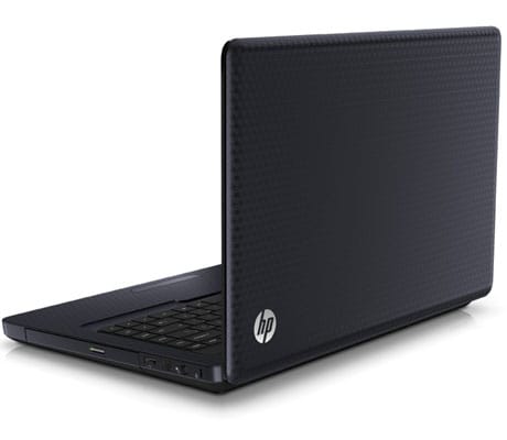
HP Pavilion G62 notebook review

Yet another laptop, and yet again the same question- is it good enough for the price?


Well, the laptop in question here is the HP Pavilion G62. This is the new Pavilion notebook series apart from the DV range which HP has. I like the DV range, so much so that I actually own one! But how good is the G-series? Let's find out.

Packaging and Contents

The G62 comes with what the laptop usually comes with- the laptop itself, a power brick, a power cord, some manuals and a bag to carry it around in.

First Impression

The G62 which I got for review was dressed in Charcoal color, with HP's now traditional Imprint finish. Thankfully, the G62 is completely matte in finish (except the border around the screen) which makes it less of a fingerprint and scratch magnet- unlike the DV range.


Performance

Powered by the Core i3 processor clocking at a very fast 2.4GHz coupled with 3GB RAM, the G62 should be fast if we look at these specs on a sheet. This machine comes with Windows Home Basic 64-bit edition, and a high end ATI graphics card.

In terms of benchmark testing, the G62 is an absolute rocket. The PC Mark score of 6622 is a clear testament to the fact that this machine is a multi-tasker's delight. There will no slowdowns even with multiple apps open.

The 3D Mark score, which evaluates the 3D rendering and gaming capabilities of the machine, clocks to a score of 4093. The ATI graphics card with 1GB dedicated video memory is a real delight for anyone who wants to have a gaming session on the G62.

The battery life of a machine so powerful, inevitably, will not be like those offered by a less powerful one. The battery completely drained out in just less than 2 hours in the battery tests. However, this test was with full screen brightness and all connectivity options switched on. If you turn down the screen brightness a bit, and switch off stuff like Wi-Fi, then the battery life improves.

The build quality if the G62 is quite solid. The keypad has a nice soft feel to it. The only niggle which I had was with the touchpad. It was as bad as the one in the HP dm3 notebook- rough to use, temperamental response and annoying to use. This can be solved if you use an external mouse, whenever you can, with the machine, though. There is no E-Sata port. However, the HDMI out will allow you to connect this machine to an HD projector or a TV as well.

Verdict

At a price of just under Rs 40k, the G62 does make a lot of sense to actually buy this one. It has the raw processing power as well as a lot of grunt for games. If you have a budget of just under Rs 40k, this is definitely my pick, even over the Dell Inspiron.


Price: Rs 38,990


Specs:

Intel Core i3 processor M370 @ 2.40GHz
3GB RAM
320GB hard drive
15.6 inch LED display (1366x768 HD Ready resolution)
ATI Mobility Radeon HD5470 graphics (1GB DDR3 video memory)
Wi-Fi/Bluetooth
3 USB
Memory card slot
HDMI out
Windows 7 Home Basic (64-bit)


Pros:

-Excellent Non-gaming performance, -Great gaming performance
-Budget pricing for a powerful laptop makes this a great deal

Cons:
-Temperamental touchpad

New 2010 Apple iPod nano Review

Every year Apple revamps its iPod lineup. Usually the changes are aesthetic in nature; but every once-in-a-while Apple does surprise us by absolutely changing or revolutionizing a product. So is the dramatic change brought about to the new nano all it's hyped out to be or will this one be washed away? Let's find out!

Packaging and Content

As usual with all Apple products, there's not a square to spare as the device is very compactly packed. The nano sits on the top floor of a small transparent plastic box which contains the nano, manuals, an Apple logo sticker, earphones, and a USB cable.

First Impressions

The nano just looks amazing! Small, compact, square, nothing like its predecessor and at just 1.5-inches, the nano can easily be misplaced. There are only 3 physical buttons on the device namely the sleep/wake button and the volume controls. With the removal of the clickable wheel and implementation of a touch screen on such a small device, you'd expect the touch to be clumps, but no. The touch felt very smooth and responsive!

The addition of a shuffle like clip at the rare of the device too is handy as the device can be easily clipped onto a wrist band, shirt, belt, you name it! At 1st glance you will notice that the device neither has a camera nor video playback capabilities unlike its previous iteration.

Setup

Setting up any iPod can be easy or irritating depending on how comfortable you are with iTunes. There is no drag and drop option like the countless otherMP3 players available and a major disadvantage being that your iPod can only be synced to just one machine.

Apart from that the setup is pretty straight forward. Download and install iTunes on your PC or MAC, import all your music and photos to it, connect your iPod and hit sync. Walla! You're all set to rock and roll!

Performance

The performance of the iPod nano is impeccable. For starters the touch is very responsive. 4 icons display on each page (swipe your finger on the device to go to the next page). You can customize the various pages by moving the icons around and of course change the background wall paper to your preference.

On the music front the nano's performance is very good. The battery life clocks in at around 20 hours of playback on a full charge. On the down side the earphones provided with the device are absolutely horrible. Whenever I shook my head left or right they just fell out. Apple if you're listening please change them!

The performance of the touch too not only felt cooler but easier to use as compared to the clickable wheel on the previous generation nano; although it is frustrating that you have to look at the device each time you want to skip a track as opposed to the clickable wheel where changing a track is just a click away.

The lack of a camera or video playback is not missed as the device is really too small for it. Photos do look good on the device but on a 1.5 inch screen, it is a strain to the eyes.

The device does possess a really cool feature. Put on the clock app and clip the device on your wrist and you have a cool watch that can play music. (Warning: it may look quite dorky)!

Verdict

All-in-all the nano is one of the coolest MP3 players out there and a must have for anyone who want to be the envy of their friends. But if you are the kind of person who is looking at value for money or is not an Apple fan boy; then for a price point of Rs 10700 or Rs 12700 (for the 8GBG and 16GB model respectively), you may want to consider your options such as the Sony Video Walkman NWZ-A845 16GB MP3, MP4 Player (price approx Rs 12000), Apple iPod Touch 8GB-3rd Gen (price approx Rs 12000), Cowon J3 4GB MP3 player (price approx Rs 10750),

Price- Rs 10700 for the 8GB variant and Rs 12700 for the 16GB variant

Pros

Cool multi touch interface
Really small and compact, perfect for the gym
Great music playback


Cons

Price
No option to change tracks without looking at the screen.
Small enough to get easily misplaced.

Dell Streak: Baby tablet or smartphone on steroids?


Dell Streak tablet review


Well, it is pretty clear that the tablets are here, and are here to stay. Their arrival has been sudden and unexpected. Whether they hurt the high end smartphones, or even the netbooks, is something which time will tell.


But the fact of the matter is- the tablets offer the complete smartphone on a bigger screen. Some people find it inconvenient, while others like the idea. But like it is with all things, there are the pros and the cons to the bigger screen.


One positive which I can think straightaway is that losing a tablet may not be as easy as losing a smartphone. And am saying this because a friend has managed to lose not one but two phones yesterday morning! I assume it will be harder to misplace a device which is slightly bigger!


Anyway, I have the Dell Streak with me, and lets find out if this device is actually a tablet, as Dell like to call it, or a big smartphone.


Packaging and Contents

The box pack includes the Streak, the iPhone-esque charger, a handsfree and some manuals. I didn't spend much time rummaging around the box because I was too eager to switch on the device.


First Impression

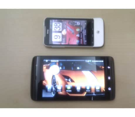
Straight out of the box, the Dell Streak made me go "wow"! The device looks classy, and worth the Rs 36000 price tag. The 5 inch screen (800x480 resolution) is of the Gorilla Glass type (as seen on the Nokia N8 as well), which makes it scratch proof. The front is all glossy black. There is one available in red color as well. The panel below the screen has 3 touch controls- Home, Options and Back.


The area around the screen is very glossy, which makes this a fingerprint magnet. The rear panel has a matte finish, however. The new slide out type battery cover which Dell have introduced with the Streak oozes class. No more using your nails to open the panel!


There is a 5MP camera at the back, and a VGA camera in the front. The power and the volume buttons are on one side panel, while the charging port is on the other side.


Performance

At a first look, the Dell Streak undoubtedlly looks like a bigger smartphone. The 5 inch screen offers lots of real estate, which means there will be a bigger keyboard, videos will be more fun to watch and apps will be able to offer more on one screen than they would on a traditional smartphone.


Switch it on, and you will be greated by the familiar Dell logo. Somehow, seeing that immediately makes me visualize a Dell laptop, momentarily, for reasons unknown!


The Streak is powered by a 1GHz Qualcomm Snapdragon 8520 processor, with 2GB memory for system and application related files only. The user memory is separate from this, and can be extended up to 48GB via the microSD card route. It's a win-win situation both ways, since the bigger internal memory will help users install more apps without getting the "out of memory" message.


The device has three touch controls next to the screen- Home, Options and Back, which are designed in such a way that it seems Dell wants you to use the Streak in the landscape mode. Also, the Homescreens do not change to portrait mode.


Slot in a sim card, put in the battery and close the rear panel (yes, the phone will not start if this is open!). The call quality offered is crystal clear. Even in a noisy situation, the in-ear speaker is loud enough to get the other person's point across. The handsfree speaker, which is quite clearly visible on the rear panel, is extremely loud. This makes it useful for calls and even for multimedia use.


The on screen keypad and numberpad has some really big keys and equally big font sizes! Be assured, you will not be pressing the number 4 when you actually wanted to press the numbet 5!


The fact that this device has a 5 inch screen means that the extra real estate in terms of screen space allows for a spaced out keyboard. Typing out messages and mails (even while using both hands) will be very comfortable, even in the portrait mode, because the keys are well spaced out. In the landscape mode however, you will need to hold the Streak with one hand and type with the other. This is because if you try to type with the same hand with which you are holding the phone, the typing finger may not even reach some of the keys! But all in all, typing out messages and emails will be a delight. And for those of you who live on the daily dose of Google Talk, Facebook and Twitter, the built-in apps will have a similarly well spaced out keyboard!


While discussing the delightfully big screen, I must mention that the Streak offers a different web browsing experience. We are all used to the smartphone web browsers, but the Webkit browser pre-loaded in the Streak does a good job of offering a good web browsing experience. However, I was not able to download Flash on the device yet, and will have to wait for the Android 2.2 update before Flash comes on board. However, websites render well on the 5 inch screen, and the multitouch screen lets you zoom in and zoom out on any specific part of the webpage. But, since this is a bigger screne than normal smartphones, the need to zoom in to read something will be minimal.


The browser's webpage rendering speeds are dependent on the network you are accessing at that time. If it is the GPRS/EDGE network, speeds will be quite slow. However, connect to a Wi-Fi network and the watch the browser come into its own. Webpages render quickly and resize well. However, on certain graphics heavy pages, there will be a bit of a lag while scrolling up and down the page.


The capacitive touchscreen response is consistent and has a sureity about it. However, I suggest you don't press the screen too hard, lest that will definitely damage the display. To test, press the screen hard and you will see the display get a "ripple in water" effect.


The Streak was launched with Android 1.6, but has now been upgraded to Android 2.1 with a promised upgrade to 2.2 in the near future. Dell have put a wrapper on the Android OS, just like HTC or Samsung do, for example, for added functionality and unique customization. Since the homescreens remain in the landscape mode, it is fun to set a widescreen image as a wallpaper. It was the yellow (with that amazing white stripe) Lamborghini Gallardo Valentino Balboni edition, which always makes me stop and gawk at it. But thats not the point! The point is that the image I put as the wallpaper was an HD image, but at some places, the yellow and the whites were getting a bit pixelated. Tried a few more images, but the same problem there too.


The Gorilla Glass touchscreen is a great addition since it keeps away scratches, which has been a problem for all touchscreen phones who don't have the screen protector. But with the Gorilla Glass, there is no need for a screen protector.


Video playback experience was something which I was looking forward to checking out. Transferring video files to the Streak was simple- no need for the Dell PC Suite. Just plug in, select "Mount SD Card" on the streak's menu and get the 'drag and drop' capability. The video playback on the device was a mixed bag, with the entire experience bordering on disappointment. Though the Standard Definition AVI files played very smoothly, there was a huge problem when it came to the 720p High Definition files. The HD files, and this was very very surprising, stuttered a lot. After some seconds, the stutter forced the audio and video to go out of sync. This was a definite disappointment, for someone who will have just shelled out Rs 36000 for this device.


The built-in media player app displays albums and songs in a very well sorted manner. Finding albums and songs will not be an issue at all. However, I missed the equalizer capability. The sound from the Streak, particularly when conencted to an external audio system, sounds flat. And there is nothing you can do about it. Maybe download another music player from the Android Market- I would suggest Rockplayer or Double Twist.


The 5MP camera at the back does a decent job of snapping images, but be assured that this one will not want you to get rid of the dedicated camera anytime soon. The camera at the front is the VGA spec one, good enough only for video chats.


Dell have done away with the MicroUSB port completely and introduced a proprietory charger, something on the lines of the iPhone. The 3.5mm jack however remains as it is, which means you can use any earphones or headphones to listen to audio, as well as connect it to any external audio source- home music system, car audio system etc.


In terms of battery life, the Streak is no better, or worse, than any other Android smartphone. The battery, from full charge to full discharge, will last anywhere between a day and a day and a half. This with the data services switched on and synching updates for apps in the background.

Verdict

Is it a phone? or is it a tablet? Well, it is actually a hybrid device- a first of it's kind- which is a for those who want the experience of a tablet in the form factor relatively similar to a smartphone. And this does a very good job of being that hybrid device, since it offers all the features.

The Streak is too big to be considered a smartphone, and is not big enough to be considered a full fledged tablet. The Apple iPad, the Olive Pad and the Samsung Galaxy Tab are all bigger than the Streak- making them full fledged tablets.

What the Streak offers is the best of both worlds. If you will not feel akward using a phone which seems a little too big when pressed against your ear (circa 1998, when the first mobile phones we laid our hands on were as big as the Streak!), then this will look like a good deal for you. Also, if you think the Galaxy Tab and the iPad are too big for you, then this is the best alternative. However, if you want the actual tablet experience on a 7-inch screen, then buy a full fledged tablet. Otherwise the Streak is ready to fill the void between your smartphone and your laptop!


Price- Rs 36000


Specs:

Quad Band GSM/UMTS dual band network
3G capable
Android 2.1 (future upgrade to 2.2)
5 inch Gorilla Glass touchscreen (800x480 resolution)
2GB dedicated memory for apps
Expandable memory up to 48GB via microSD
Wi-Fi and Bluetooth
5MP camera at the back and VGA camera for video chats
Webkit web browser
Lithium ion battery


Pros:

Superb build quality
Gorilla Glass prevents scratches on the screen
5 inch screen makes the keyboard usage seem more comfortable


Cons:

Too big to be "just a phone" and too small to be a tablet
Stuttering playback of HD videos

F&D A520 speakers: Serious punch, unbelievable price

Fenda Audio A520 speakers

Well, it is a fact that almost everyone who has a desktop PC at home has connected an external speaker system to it. Be it the portable ones, standard 2.0 channel ones or bigger.

The 2.1 channel speakers are probably the most popular, since they tend to offer a wholesome listening experience thanks to the woofer!

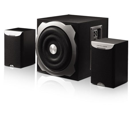
Fenda Audio sent the A520 speakers for review. They are 2.1 channel type speakers- two speakers and a sub. How good are these? Let's find out.

Package and Contents

The box pack contains the two speakers, the sub woofer, two aux cables to connect other devices with, and some manuals.


First Impression

The A520 look pretty standard at first look. Dresses in matte black finish, combined with dollops of grey, they look classy. And since they are not glossy, thankfully, you won't have to worry about them getting scratched.

The sub has a wooden case, quite expectedly. Good thing, because with the solid casing, the bass reproduction will be better. The speakers are in a plastic case, but feel quite solid, nevertheless.

The two speakers don't have the removable front grille, whichh a lot of rival products offer. Even though that does not serve much purpose in terms of performance, it just adds to the look of the product.


Performance

Setting up the speakers is a breeze. All cables are provided in the box pack, and the length of the cables is decently long enough to allow users to place the speakers where they want, at most times.

Connect the Speakers to the ports on the sub, connect the audio in cable with an external device (I connected them with the iPod and the laptop, but you can connect devices like a TV, Gaming console or even a DVD player), plug in the power and you are good to go.

The sub, basically, has all the controls. The volume, bass and power switches are near the in-out ports.

Switched on the A520 for the first time and went about with doing my routine work imagining that these speakers will be standard run of the mill ones and shall keep playing music effortlessly in the background. But how wrong I was! And for the better. The V520 made me stop whatever else I was doing and I was looking at the speakers for a couple of minutes with an expression of shock and awe (or so I assume!). Please allow me to explain.

The 2.1 channel speakers usually focus on delivering clear voice, and thus don't focus too much on the bass output. For a bass addict like me, that has always been a turnoff. The A520 ones were not only delivering good clear vocals, but pumping out some really powerful bass. Further pumping up of the volume made the blood flow even faster! Tweaking the bass via the knob on the sub allows users the ability to manage the punch they want in the audio. To test it fully, I turned the knob to full, volume level to about 90% and went into the next room. The audio was seamlessly penetrating the walls, with absolutely no loss of clarity. The speakers have a max volume output of 5000W P.M.P.O., and for good reason! Fantastic, for speakers which cost Rs 3490!

And since I was testing these speakers at 7am in the morning, my day was made!

Essentially, you can place these speakers in one room, and be rest assured that the volume level will be good enough for a house party!

However, there are some niggles. First and foremost, the A520 does not have a remote control. It is expected that the user will control the volume from the device which has been conencted, but that is a little inconvenient. A remote would have made things better.

Second, the speaker cables are connected internally on the speaker. The drawback of such a setup is that if the cable gets damaged even slightly, then the speaker is pretty much ruined.

Third, all controls are at the back of the sub, and access to these is a little difficult. Volume control on one of the speakers would have made matters easier to deal with!


Verdict

At a price of Rs 3540, you cannot go wrong if you do buy these speakers. The performance is excellent, and the build quality is solid. Buy these if you need speakers for the PC at home, or just someting to plug your phone, mp3 player or TV to, for the want of better sound.

Price- Rs 3490


Specs:

Multimedia speakers
2.1 channel type
5000W P.M.P.O
6.5 inch sub
4 inch satellite speakers
Wooden cabinet for sub
Compatible with Mp3 players, phones, PC and TV
Subwoofer Frequency response: 20Hz~120Hz
Satellite Frequency response: 120 Hz~20KHz
Output power (RMS): 16Watt x 2 + 20Watt


Pros:

Superb audio clarity even at high volumes
Powerful bass
Solid build


Cons:

No remote control
Volume control placed on the sub is difficult to reach

Vivitek D530 projector: Priced right enough for a basic projector

Vivitek D530 projector

Even though the world is looking forward to the High Definition (HD) television and movie viewing experiences, there are lot's of projectors available in the market which are not HD capable. And still, they are selling well. Why? Probably the price.

At a price of Rs 38,000 for the projectors, people are enticed by the ability to blow up the videos to anywhere between 40 inches and 120 inches on the wall.

The Vivitek D530 projector is one such projector. Is it good enough?


Package and Contents

The D530 comes with the VGA cable, remote control, carry case and some warranty and usage information.

First Impression

Dressed in white color, the D530 looks really classy. the control buttons are on the top panel. There are the vents and the speakers taking up the two sides, while all input controls are on the rear panel.

The remote is the card type one, with clearly marked buttons. The setup too was simple. Let's see how it performs.


Performance

I plugged in the WD TV Live, via the HDMI, to the projector, and immediately realized there was a problem. The audio was playing from the speaker built into the projector. In simple terms- Not Nice!

I did some fiddling around, and ultimately had to connect my home theater system to the audio-out on the WD Live media player. Now, this is a major drawback, since the D530 does not have a dedicated 3.5mm Audio Out to which I could directly connect the speaker setup.

Well, let's focus on the positives now! The image size I got was about 46 inches, with the projector placed about 3 feet from the wall. And the image reproduced was in the the 800x600 resolution. Not a lot by any stretch of the imagination, but still decent enough to enjoy a movie. Even if you connect an HD video source, like I did, the projector will scale down everything to fit the 800x600 display resolution it is capable of.

The reproduced image was quite good, with good color depth and sharpness.

The projector menu has a host of image management options- which is good considering that people are not always happy with the default settings. These come in handy for different uses- presentations, movie viewing etc.

Another thing with a resolution, which is on the lower side of the resolution tree, is that you sit as far away from the wall as possible. The close you get, the grainy the image becomes.

The remote responds well to button presses, even when it is not directly aimed at the projector.

Another thing with the D530 is that it can heat up quickly and then the fan becomes quite noisy. Better to use it in an air-conditioned environment, to keep it cool.


Verdict

At a price of Rs 38000, I really can't hold anything against the projector, except probably the lack of audio out. The resolution capabilities may not be the best out there, but then again, the price point makes it a good buy for someone who doesn't want HD but just a big screen movie experience.


Price: Rs 38000


Specs:

Multimedia and Office projector
800x600 native resolution
3200 lumens
3000:1 contrast ratio
3000 hours lamp life
Image projection size 40" to 300"
16:9 video resolution type
Built-in speakers
HDMI in
VGA and Composite video input


Pros:
Price

Cons:
3.5mm Audio out option missing

Nikon Coolpix L22 Review

Point and shoot digital cameras are pretty handy if you cell phone/smart phone isn t one that boasts of an exceptional camera. So is the Nikon Coolpix L22 one to be carried around or will it be forgotten in a crowd? Lets find out!

Package and Contents

The packaging of the Nikon Coolpix L22 is the same as that of its younger brother the L21. The cardboard box houses 2 x AA alkaline batteries, a USB cable, Installation CD, manual, strap and the camera itself.


First Impression

The camera has a plastic body with a brushed aluminum finish with a standard black mat finish at the back and a coloured front (our review unit was a silver one). The camera is no eye catcher unless you pick up one the more fancy colours namely the red, blue or the black one. The device does feel solid in ones hands and the most striking feature is the 3-inch LCD display at the back.


Performance

For a box price of just Rs 7450, the device does pack quite a punch with an array of customizable features which begins with a maximum picture resolution of 12 MP, White balance options, continuous shoot, colour tone options (vivid, black and white, etc) and the same backlit options as its predecessor (the L21) such as portrait, landscape, night portrait, indoor, beach snow, sunset, dawn, the list is quite long.

In terms of actually clicking the images, the image quality is crisp at 12MP resolution, and can be viewed with great comfort on your big TV.

The lack of an SD card straight out of the box is felt as the device can click and store only 2 images taken at maximum resolution on the internal memory. The camera also runs on 2 x AA alkaline batteries. Out of an average pair of batteries expect to click around 240 images.

The 3-inch LCD is something that the device can boast about, as images look crisp and clear on it. The quick access buttons along side the menu button are well laid out on the right of the LCD.


Verdict

All in all this is a good entry level point and shoot for all those hoping to get good picture quality along with control over a few functionalities such as white balance, continuous shoot to name a few.


Box Price- Rs 7450.

Specs:
12MP camera
3.0-inch LCD display
3.6x Zoom
2x AA Batteries
19MB internal memory
Video capture resolution of 640x480


Pros
Easy point and shoot
Array of backlit shooting modes
Image quality is good


Cons
None

Lenovo C- series AIO PC: Affordable AIO; basic performance

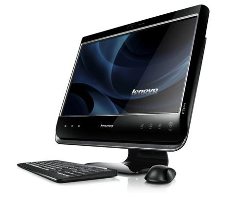
The Lenovo All in one Desktop PC

Companies have started jumping on the all-in-one PC bandwagon in a big way now, now it's Lenovo's turn to take a stab at the affordable all-in-one PC.


Packaging and content

The PC itself comes packaged in wooden box with standard thermocol covering, the keyboard comes housed in a seperate box, while the mouse comes packaged together with the power cord, a whole lot of manuals, and a CD (with some more manuals!! sigh!!) and some drivers and software, a neat little package.


First Impressions

The nice black and shiny exterior, with grill shaped speakers at the bottom and the nice 18-inch 16:9 wide screen display give of a positive first impression, though that's dampened a bit when you find out the build quality is plastic. The keyboard especially is not of great build quality, a better graded plastic would be nice, but it is understandable that Lenovo went with this build to keep the price down. The DVD drive is housed neatly to the right of the System, while the left houses a memory card reader, 2 USB drives and a Headphone and Mic input. The back of the System, houses another speaker, PS2 keyboard input and 3 additional USB drives, the stand is adjustable which is a nice touch, the front of the System has a Web cam on top and the usual assortment of Menu Buttons with the shiny Lenovo logo residing in the middle, next to the logo the Wi-Fi and the hard disk activity lights take up their positions.


Performance

As you can tell by the specification, the hardcore need not apply. This functions more as a entertainment solution, a HUB to watch films, browse the web etc. Even though the Atom D510 isn't going to win any awards for it's speed, it's good at what it does- enable you to watch movies etc, at good quality. But be warned, those wandering in expecting to watch anything in HD are going to be disappointed, as there is noticable lag and ghosting when it comes to watching HD on this system. The games, as expected, performed poorly but this was not meant to appeal to the gaming crowd in the first place. It woud be a little unfair to judge it based on the gaming performance solely. The webcam is good, if not exceptional and the speakers do a good job though there is notable lack of bass. Quite expected from a system with built-in speakers. The DVD writer works as advertised and USB drives function well. Like we said earlier, we would like better build quality of the keyboard, as it feels plasticky. The mouse seems to set to low sensitivity by default, but nothing a quick little tweak in the windows control panel cant change though.


Verdict:

Overall, as a media HUB it functions well, though Lenovo might want to provide a graphics solution as an option.


Price: Rs 21890


Specifications
Processor: Intel Atom D510 1.66Ghz
Memory: 1GB DDR2
Hard Drive: 160 GB SATA II
Optical Drive: DVD-RW
Graphics: Intel Integrated
Wi-FI: 802.11n
5 in one memory card reader
OS: Windows 7 Starter


Pros:
Price
Full AIO PC experience


Cons:
No gaming capability